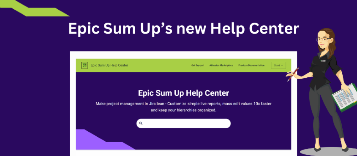
When we describe Epic Sum Up, we will often mention that it helps project managers who use Jira find the information they need quickly. Epic Sum Up packs an incredible range of powerful functionalities and features, but one of the key reasons our users love it is that it’s very easy to use. We wanted that same principle – finding information simply and quickly – to be fully reflected in our user documentation as well, across all Epic Sum Up versions.
ESU requires little or no configuration and it’s there where you need it in Jira – adding visualization everywhere with the detailed project data just a click or two away. In short, Epic Sum Up offers a frictionless experience, adding timesaving project management features on top of Jira’s native functionalities.
Documentation challenges
After the recent major release – the ESU 4.0 version, Epic Sum Up is now very close to a full-suite project management app for Jira. However, no matter how complex your product is and how many features it packs, it doesn’t mean that its documentation needs to be complex as well.
Our help center for ESU, however, did pose some challenges to our users and we decided to change the entire documentation system using a new tool.
Here are some of the challenges we faced:
- Managing documentation of all three versions – Cloud, Data Center and Server – separately was becoming difficult.
- The structure for our documentation in Confluence was complicated and outdated.
- It was very easy to end up in the wrong version space.
- Some users found it especially challenging to navigate Confluence.
Managing versions
I’m sure managing documentation for multiple product versions is a familiar headache for any software development team. When it comes to software in Atlassian ecosystem, the headache triples for any apps that are, like Epic Sum Up, developed for all three hosting options – Cloud, Data Center, and Server.
We maintained separate documentation for all three. And yes, we managed versions with each of the three spaces.
Our former approach was to add paragraphs to a documentation page for each new version, on top of each other. Each paragraph would be named after the version it relates to – for example 3.7, 3.8, and the latest version would be on top of the page.
Yes, it was not a great experience, as you can well imagine.
Navigation issues
Navigation was another challenge that had significant – and quite measurable – ripple effects, undermining efficiency for both users and our team as well. Because of the complexity and cumbersome navigation, you would often end up in the wrong documentations space. For example, you could easily end up looking up Server version documentation when you needed details of a feature of the Cloud version.
These navigation issues resulted in many support tickets that wouldn’t have been submitted if you could find what you needed in documentation more easily.
In short, we needed a much simpler tool for documentation that would take you to the right documentation space, and let you easily find the information you need.
Finding the right solution
And that was my task. As the person in charge of customer experience (and marketing) at APTIS, I was determined to find a solution that would cover all of our needs.
Here are the key features I was looking for:
- The tool needed to be easy and simple to navigate, especially when it comes to switching between variants and versions.
- It needed to be simple to use on our side as well, so that we could easily manage updates.
- We needed a new and easier structure underlying both points mentioned above.
- I was also looking for great design – another important user experience element not to be overlooked.
When I started my search for the right tool to build our help center, I focused on looking at real-life examples. And a solution did stand out – I really loved what K15t, another Atlassian Marketplace Partner, did with the documentation for their Scroll Viewport for Confluence app.
Benefits and best practices
Scroll Viewport has solved our multiple-versions challenge – turning a clunky, awkward system into an easy and simple one. And it worked on both sides – for people using the help center and for us.

By loading the video, you agree to YouTube's privacy policy.
Learn more
The help center is now easy and simple to navigate. Switching between versions and finding the information you need is now without hassle.
For us, managing the updates for user documentation became much easier.
Another Scroll Viewport feature important for a small lean team – like we are at APTIS – are the design options. With plenty of templates and an easy layout editor, creating a beautifully designed help center was a breeze.
In our new help center we were able to implement all the best practices for user documentation, from well-structured organization to a great versioning and updates system. We were also able to broaden the type of content in our help center, offering now not just the plain, technical user documentation but also the guidelines on how to use Epic Sum Up more efficiently.
Be sure to check out our new Help Center here.


